Claude Dashboards and Motion bring two different kinds of work into the spotlight: exploring changing data and explaining an idea visually. Anthropic’s October 8 announcement is useful news for people who regularly turn spreadsheets, reports and project updates into something colleagues can understand.
The right starting point is the question you want to answer. Do you need to investigate what changed, or communicate a result you already trust? That distinction helps you choose a useful output before spending time polishing charts or animation.
Last reviewed: October 11, 2026. This guide draws on official documentation. The example prompts and workflows are editorial suggestions, not first-hand product test results.
The update at a glance
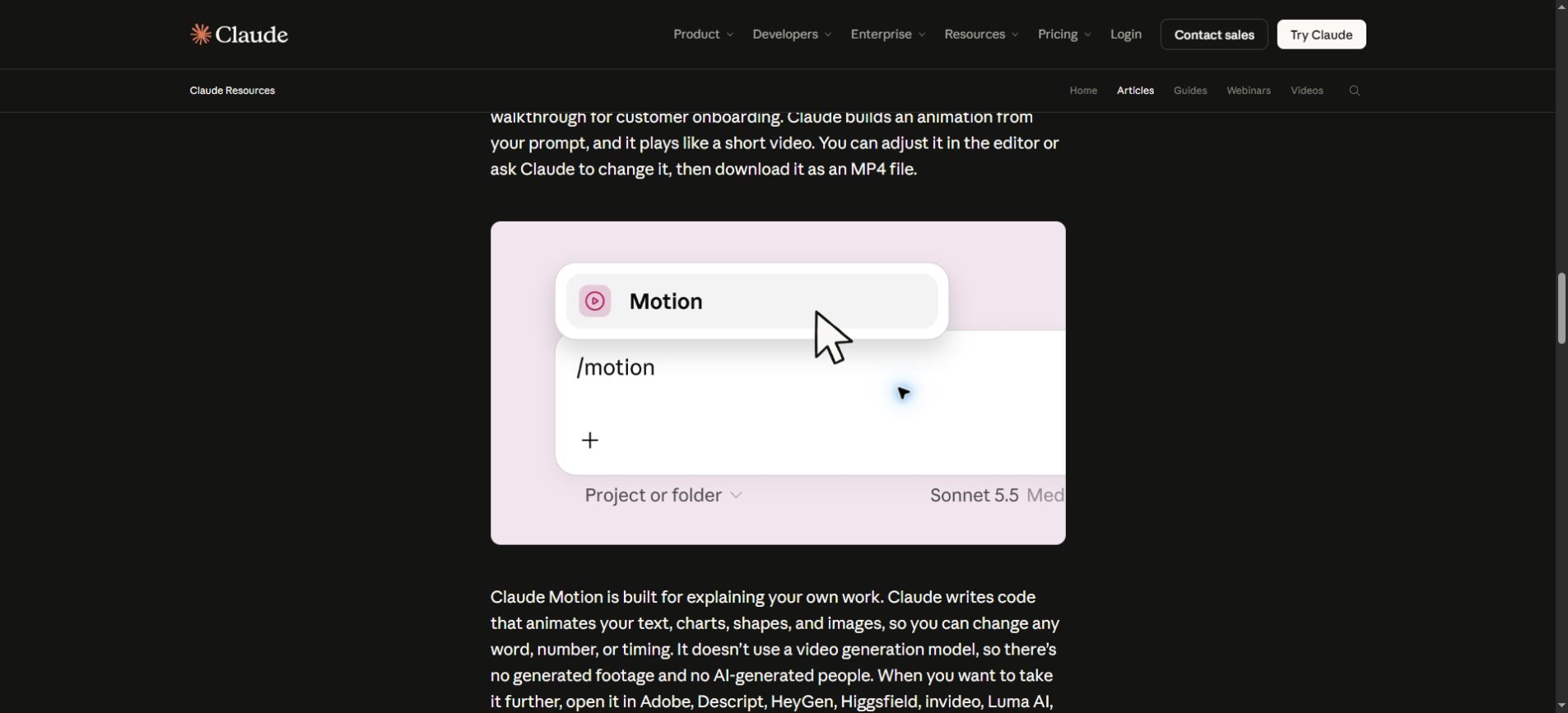
According to Anthropic’s announcement, Claude Dashboards and Motion are in beta. Dashboards can work with connected data, expose chart queries and show refresh times. Motion creates editable, code-based animation and exports MP4 video; it is not a generative-footage model. Docs, Slides and Design have also left beta.
| Feature | Best starting question | Availability in current documentation |
|---|---|---|
| Dashboards | What changed in these numbers? | Beta on Pro, Max, Team and Enterprise. |
| Motion | How can I explain this idea clearly? | Beta on Team and Enterprise. |
| Docs, Slides and Design | What should this document or presentation say? | Available on all plans, including Free; organization settings can apply. |
The Claude Artifacts help page lists these plan differences. Enterprise Dashboards and Motion are off until an owner enables them; Docs, Slides and Design are scheduled to turn on by default on October 15, 2026. A missing template can therefore be an administrative setting rather than a broken account.
Choose the output before choosing the prompt
A dashboard should help someone investigate a question. An explainer should help someone follow a message. Combining those jobs too early can produce a beautiful presentation built around an unverified number.
For example, a marketing team might first investigate why signups changed. Only after checking the result should it create a short explainer for a weekly meeting. The dashboard supports the analysis; the animation presents the conclusion. Each needs a different review.
| Your situation | A useful first output | What to verify |
|---|---|---|
| You are unsure which channel changed | A small comparison dashboard | Dates, filters and metric definitions. |
| You know the finding but colleagues miss the point | A short visual explanation | The claim, labels and pacing. |
| The data sources disagree | A reconciliation note | Which source is authoritative and why. |
| The audience needs to explore details | A dashboard with clear filters | Whether each filter changes the intended data. |
Build a dashboard around one decision
Start with a question narrow enough to answer in one sentence. “How is the business doing?” is difficult to evaluate. “Which acquisition channels changed most compared with the previous complete week?” gives the dashboard a clear purpose.
Write down what someone should do after reading it. If no decision or follow-up question depends on a chart, that chart may be decoration. A smaller dashboard with three useful views is often easier to review than one filled with every available metric.
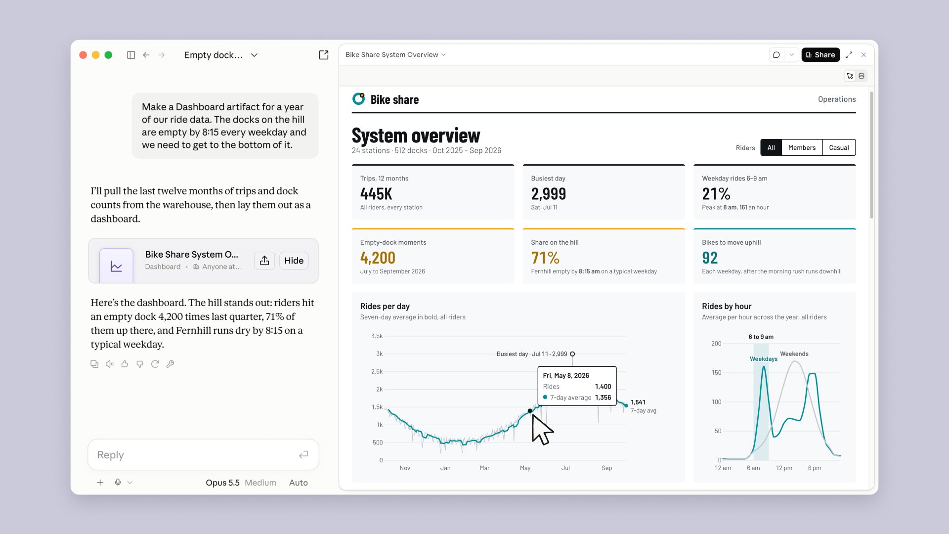
Anthropic describes connections to data platforms including BigQuery, Databricks and Snowflake, plus business connectors such as Salesforce. Its official example below illustrates the dashboard format. Actual access depends on the connections and permissions available to your account.
Define the metric in plain language
Before asking for a chart, define what counts. Does a signup mean a new account, an email verification or a first completed session? Does revenue include refunds? Which time zone determines the reporting day? These choices can change the conclusion even when the query runs successfully.
Keep those definitions visible in the task brief. If the definition is uncertain, ask for a list of ambiguities before requesting a finished dashboard. It is much easier to fix a metric definition than to discover later that an entire presentation used the wrong one.
Example dashboard brief
Create a draft dashboard for weekly signups from the approved source. Compare the last two complete Monday–Sunday weeks in UTC. Count distinct new account IDs, exclude test accounts, and separate acquisition channels. Show totals, absolute changes and percentage changes. Flag missing channel values. Explain the calculation behind each chart and do not infer why a change happened.
This prompt defines the reporting window, counting rule and limits of interpretation. Replace the illustrative definitions with your own. Do not connect production data merely to try a prompt; begin with an approved sample or a limited source set.
Check totals before interpreting patterns
Compare a dashboard total with a trusted export or an existing report for the same period. If they disagree, inspect filters, duplicate records and date boundaries before asking the AI to explain the trend.
A percentage increase can look dramatic when the starting number is small. Show the original counts beside the percentage. Also separate a change you observed from a cause you have proven: a chart can reveal an association without explaining why it happened.
Keep a note of the reporting period and the source you checked. A dashboard that refreshes later may display a different number. Your written conclusion should remain understandable even after the next update.
Turn a verified finding into a short explainer
Motion is most useful when the message has a sequence: first the problem, then the comparison, then the decision. Sketch that sequence before asking for animation. A three-scene outline gives you something concrete to review.
For a weekly update, the first scene might introduce the reporting period. The second can show the verified comparison. The last can state the next step and any uncertainty. Use motion to guide attention, not to imply that a weak finding is more certain than it is.
Example explainer brief
Create a 30-second animated explainer from the approved summary. Use three scenes: reporting period, the verified comparison, and the proposed next step. Preserve every number and unit exactly. Use high-contrast labels, restrained transitions and enough reading time. Do not add causal claims, forecasts or new statistics. Show the text and timing for review before the final version.
Treat this as a creative brief, not a guarantee of exact output. Review the rendered animation against the approved summary. A number can be correct in the source but mistyped in a label, shown with the wrong unit, or left on screen too briefly to read.
Make it readable without the presenter
Someone may watch the explainer on a phone, in a meeting without sound, or after the original discussion. State the main point in visible text. Avoid placing important details only in narration or tiny footnotes.
- Use one central claim per scene.
- Keep labels short and contrast them strongly against the background.
- Show units and the reporting period alongside numbers.
- Leave enough time to read each scene without pausing.
- Provide a static summary for readers who prefer it or cannot use motion.
Check a small-screen version before sharing. If a chart only works on a large monitor, simplify it rather than squeezing the text smaller. A useful explainer should reduce the audience’s effort.
Permissions and sharing deserve their own check
The Artifacts admin guide distinguishes external sharing from email invitations. It also states that artifacts using connected apps cannot use “Anyone with the link.” Do not assume a dashboard can be distributed in the same way as a static presentation.
Before sharing, identify the intended audience and inspect the actual access setting. Avoid including customer details, internal forecasts or other restricted information in screenshots prepared for a wider audience. Review the output itself, not just the source folder permissions.
The same guide says artifact use draws on existing Claude usage limits. Check your plan and organization’s controls before running a large batch of revisions. A focused brief and a short review checklist can reduce unnecessary iterations.
A repeatable review checklist
Use this checklist for your first small project. It is an editorial workflow you can adapt to other AI tools as well.
- Question: Is the decision or message clear before any visuals are created?
- Source: Is the data approved, current and relevant to the reporting period?
- Calculation: Have you checked totals, units, duplicates and filters?
- Interpretation: Are observations separated from unproven explanations?
- Design: Can someone read the labels on a small screen?
- Sharing: Have you checked the audience and actual access settings?
If an output fails one check, revise that part specifically. Asking for a complete redesign after every issue can introduce new errors into material that was already correct. Keep the approved numbers and claims stable while adjusting the presentation.
For stronger task instructions, see our guide to writing AI prompts. For workflows that combine source material and instructions, our context engineering guide explains why selecting the right context matters.
Frequently asked questions
Are Claude Dashboards available on the Free plan?
The current Artifacts help page lists Dashboards on Pro, Max, Team and Enterprise. Free-plan access to Docs, Slides and Design should not be confused with access to every template. Verify the latest plan details before upgrading.
Does Claude Motion generate realistic video footage?
Anthropic describes Motion as code-based animation of elements such as text, charts and shapes, rather than a footage-generation model. Choose the format based on the result you need: an animated explanation and a cinematic video are different tasks.
Can an AI dashboard replace a trusted business report?
That should depend on validation, not appearance. Check definitions and reconcile the results with a trusted source first. Keep an established report as your reference until the new workflow has demonstrated consistent, reviewable results.
What is a sensible first project?
Choose a low-risk recurring update with a small source set and a person who can check it. Build one dashboard question or one short explainer, record the time spent reviewing it, and compare the finished result with your usual process.
Start with a question worth answering
The practical opportunity is a shorter path from information to understanding. Begin with a defined metric, verify the result, then choose the visual format that helps your audience use it.
For teams trying these features, a careful first project will teach more than a complicated demo. Judge the workflow by the clarity and reliability of the reviewed output, including the effort needed to get there.