An AI color palette generator can take a mood, a photo, or a starting color and suggest a set of swatches. Before you use the result on a website, give every color a job. A palette can look balanced on a mood board and still produce a button label that’s hard to read.
This guide builds a five-color palette for a fictional café website. Follow the example to choose which colors go together, check contrast, and keep the design consistent when you apply it to a real page.
Start with one page and a short brief
The café needs a light background for its menu, dark body text, a prominent booking button, and two accents for small details. The page should feel outdoorsy and welcoming. That brief gives an AI tool enough direction to suggest useful colors and gives you a way to reject colors that don’t fit.
Decide whether to start from words or a reference image. A text prompt works well when you can describe the mood and roles. A photo works well when the site needs to match an existing product or place. Use the photo’s extracted colors as candidates, then adjust the lightest and darkest swatches so they work together.
If you prefer to browse combinations visually, Khroma learns your color preferences and suggests combinations. Choose candidates there, then test the actual pairs you plan to use. Khroma.

Give each swatch one clear role
| Role | Example hex | Where it goes |
|---|---|---|
| Page background | #FFF8E6 | Main page and menu sections |
| Body text | #20332A | Headings, descriptions and prices on cream |
| Primary green | #245342 | Booking button background with cream label |
| Coral accent | #ED786B | Small badge with dark green text |
| Soft gold | #F4D889 | Callout background with dark green text |
Try the palette on an actual headline, a short paragraph, and a button within the same layout. If two colors both compete for attention, reserve one of them for a small detail. In this example, using green for the booking button and coral for a seasonal badge keeps their roles distinct.
Copy this prompt into an AI palette tool
Suggest five sRGB hex colors for a café website with a warm outdoor feel. Give each color one job: page background, body text, primary button, accent badge, or callout background. Use warm cream, forest green, coral and soft gold. List the proposed text color for the button, badge, and callout. Treat any contrast ratios as estimates for me to verify separately.If the first palette feels too busy, ask the tool to keep the background and text fixed while producing three alternatives for the accent. Changing one role at a time helps you see which adjustment improves the page. For more ways to define useful constraints, read our guide to writing AI prompts.
Check the pairs readers will actually see
Test each text color against the background it sits on. WCAG 2.2 Level AA calls for at least 4.5:1 for normal text and 3:1 for qualifying large text, subject to the criterion’s exceptions. Use the small-text threshold for ordinary button labels, captions, and prices unless they qualify as large text. W3C guidance on minimum contrast.
| Pair | Contrast | Normal text at AA |
|---|---|---|
| Dark green on cream | 12.64:1 | Pass |
| Cream on primary green | 8.29:1 | Pass |
| Cream on coral | 2.64:1 | Fail |
| Dark green on coral | 4.78:1 | Pass |
| Dark green on soft gold | 9.58:1 | Pass |
The coral badge is the instructive case. Cream looks natural next to coral on the swatch board, but the combination misses even the large-text threshold. Switching the badge label to dark green clears the normal-text threshold with the same coral background. A contrast checker lets you repeat that comparison with your own hex values. Adobe Color Contrast Checker.
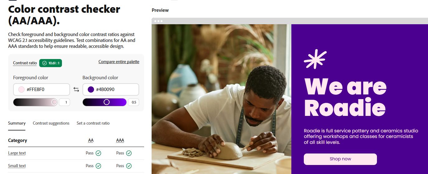
Check hover and focus styles too. A button can pass in its default state and become harder to read when the background changes. If the color sits over a photo, gradient, or translucent overlay, test it on the actual background where the text appears. Use a solid backing if the image makes contrast unpredictable.
Keep the palette consistent as the site grows
Save both the hex codes and their roles. Naming a color by its job makes it easier to change later. For example, a site stylesheet might use --page, --text, --primary, --on-primary, and --badge. Store the foreground and background together wherever the pair matters.
Before reusing the palette for dark mode, build a separate set of pairs and check each one. A green that works well for a button on a cream page may be hard to distinguish on a dark surface. The same applies when you move the colors into slides, email headers, or product graphics.
Common palette questions
How many colors should I generate?
Five is a useful starting point for a simple site. Add a shade when you need a new role, such as a subtle border or a distinct focus state. Use the same role names across pages.
Can an AI color palette generator make an accessible palette?
It can suggest candidates. Check the specific foreground and background pairs in the finished design, including states and overlays. Text contrast is one part of accessibility.
How do I keep an accent color that fails contrast?
Try changing the label color first. If no suitable label color passes, use the accent in a decorative area or adjust its shade, then measure the new pair.