
A spreadsheet can answer a simple question and still lead to a bad decision. Imagine a small shop sees sales rising from January to March. Should it buy more stock? Before deciding, someone needs to check what changed, whether the figures are complete, and whether one unusual order distorted the trend. AI data analysis can speed up those steps, but it cannot replace them.
This guide shows a repeatable workflow: prepare a clean file, ask a precise question, inspect the calculations, choose an honest chart, and turn findings into a decision with clear limits. You do not need to be a programmer to start. You do need to remain responsible for the numbers.
Last reviewed: October 5, 2026. Product features and file limits change. Verify current availability and privacy controls in the tool you use.
What is AI data analysis?
AI data analysis means using an AI assistant to help explore, clean, summarize, calculate, visualize or explain information in a dataset. A tool may read a CSV or Excel file, create a table, suggest formulas, run code, draw charts and describe patterns in plain language. The value is faster exploration and communication—not automatic certainty.
Different products work in different ways. OpenAI describes file-based analysis and charts in ChatGPT, Microsoft documents Copilot insights in Excel, and Google documents Gemini analysis in Sheets. Features depend on plan, account and the file structure.
Start with a question a decision-maker can answer
“Analyze this spreadsheet” is too broad. State the decision, metric, time period and comparison. For example: “Did monthly revenue increase from January to March, and did online or store sales contribute more? Show the source rows and calculations.” That instruction tells the assistant what result would be useful and how to make it auditable.
Write down a working definition for each metric before uploading. Revenue may mean gross sales, net sales after refunds, or cash received. Conversion rate may use visits, sessions, leads or people as its denominator. A confident answer to the wrong definition is still wrong.
Describe the columns and identify missing values, duplicate rows, inconsistent dates and possible outliers. Do not change the file yet. Ask me to confirm how revenue and refunds should be defined before calculating the main result.
Prepare the spreadsheet before asking AI
AI assistants do best with structured data: clear headers in the first row, one record per row, one value per cell, and consistent types. OpenAI’s data-analysis guidance recommends descriptive column names and avoiding empty rows that split the table. Clean structure also makes manual verification possible.
- Use explicit headers such as Order date, Channel, Revenue and Refund.
- Keep dates in one format and document the time zone where relevant.
- Keep units consistent: do not mix dollars with cents, kilograms with pounds or percentages with whole numbers.
- Make blanks meaningful. A blank discount may mean zero, unknown or not applicable; decide which.
- Preserve an untouched source file and analyze a working copy.
- Remove information that is not needed, especially personal identifiers or confidential notes.
Do not ask the assistant to “fix everything” silently. Request a list of proposed changes and row counts before and after cleaning. A dropped duplicate, parsed date or missing-value rule can change the conclusion.
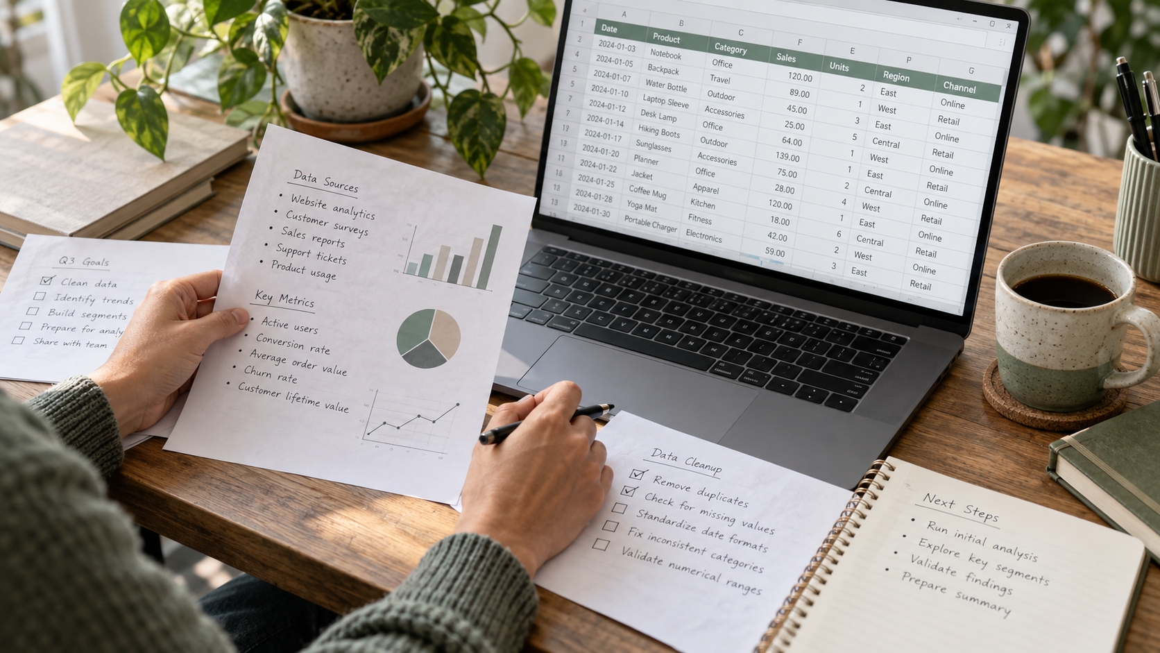
A worked example: six sales rows, one useful question
Suppose a shop exports a tiny sample with two channels—Online and Store—for three months. The numbers below are illustrative, not results from Unlimited AI or a real business. The point is to see the arithmetic before trusting a generated summary.
| Month | Channel | Revenue ($) |
|---|---|---|
| January | Online | 120 |
| January | Store | 80 |
| February | Online | 150 |
| February | Store | 90 |
| March | Online | 180 |
| March | Store | 70 |
January totals $200, February $240 and March $250. Across all six rows, revenue is $690. Online contributes $450 and Store $240. March is 25% above January: ($250 − $200) ÷ $200. Those statements are reproducible with a calculator.
The interpretation requires more care. Online grew each month, but Store fell from $90 in February to $70 in March. A headline saying “all sales are growing” would be false. Nor can these six rows establish why revenue changed, whether profit increased, or whether demand will keep rising.
Group revenue by month and by channel. Show row counts, totals and the formula for January-to-March percentage change. Separate observations from hypotheses. Do not infer profit, causation or a forecast from this file.
A seven-step AI data analysis workflow
1. Inspect the file and define the question
Ask the assistant to list columns, data types, date range and number of rows. Confirm whether each row represents a sale, a customer, a product or an already aggregated total. A “total revenue” calculation can double-count if the file includes subtotals as well as detail rows.
2. Audit missing, duplicate and unusual values
Request counts for blanks, duplicates, negative values and entries outside expected ranges. Ask for examples and row identifiers rather than a vague statement that the data is “clean.” Decide with the data owner whether refunds, cancellations and test transactions belong in the analysis.
3. Make transformations explicit
If the assistant converts dates, standardizes labels or removes rows, have it show the rule and a before-and-after count. Keep the original file unchanged. For larger datasets, ask it to provide the formula or code used so another person can repeat the result.
4. Calculate a simple baseline
Start with totals and counts you can check by hand or with a spreadsheet formula. Reconcile the sum of groups to the overall total. If grouped revenue adds to $680 but the file total is $690, investigate before asking for a prettier chart.
5. Explore one comparison at a time
Choose a comparison that fits the decision: month by month, channel by channel, product category or region. Avoid generating dozens of charts without a hypothesis. Ask what changed, how large the change is, and whether the pattern survives after excluding obvious anomalies.
6. Visualize the result honestly
Use a line chart for a time series and a bar chart for category comparisons. Label units, date range and filters. A bar chart should generally start at zero to avoid exaggerating small differences. If a chart combines measures with different units, explain them or use separate panels.
7. Verify and communicate the decision
Write a short finding that includes the number, comparison, source file and limitation. A decision-maker needs to know what the data supports and what it does not. Keep the actual decision with a person who understands costs, context and risk.

Prompts that produce more useful analysis
A strong prompt names the file, the columns, the calculation and the output. It also tells the assistant what uncertainty to report. Our AI prompting guide explains the broader pattern: goal, context, input, constraints and format. Apply it to data rather than asking for a generic summary.
For a sales trend
Using the uploaded sales table, calculate monthly net revenue as sales minus refunds. Group by month and channel. Show the row count in each group, the calculation method, a simple chart and three observations supported by exact numbers. Flag missing dates and any months with fewer records.
For customer feedback
Classify comments into no more than six themes. Define each theme, count the comments in it, and include two short representative examples with row IDs. A comment can have multiple themes. Mark ambiguous cases instead of forcing a label, and do not infer customer demographics.
For a formula review
Explain what the formula in column G computes and identify any rows where the inputs are blank, zero or inconsistent with the stated business rule. Suggest a corrected formula but do not overwrite the workbook. Show how to test it on three known rows.
If the assistant proposes a surprising result, ask for the exact rows behind it. In Excel, Microsoft recommends naming the columns in your question and reviewing the source data behind an insight. That is good practice in any tool.
Which chart should you ask AI to make?
| Question | Useful chart | Check before sharing |
|---|---|---|
| How did a metric change over time? | Line chart | Dates are ordered; gaps and time intervals are visible. |
| Which category is larger? | Bar chart | Same units, clear category labels and sensible zero baseline. |
| Are two measures related? | Scatter plot | Outliers are shown; correlation is not called causation. |
| How is a total divided? | Bar chart or small pie chart | Parts add to the defined whole; labels and percentages agree. |
| Where is a distribution concentrated? | Histogram | Bin sizes are sensible and the sample size is disclosed. |
A chart can be technically correct yet misleading. For example, a truncated vertical axis can make a 2% movement look dramatic. A pie chart with many tiny categories hides differences. Always review the underlying table, not only the visual.
What AI can do well—and where it still needs you
- Useful: Explain columns, draft formulas, group records, detect obvious anomalies, build a first chart and turn verified results into plain language.
- Requires review: Choose whether a missing value should be excluded, interpret a business metric, decide if an outlier is an error and explain why a trend occurred.
- Should not be delegated blindly: Publish financial claims, make hiring or lending decisions, expose private data or act on a forecast without validation.
AI output can sound more certain than the data warrants. A model may invent a causal story, confuse percentages with percentage points, group dates incorrectly or overlook a hidden filter. These are variations of the reliability issues in our AI hallucinations guide.
Privacy and file-handling checks
Before uploading, decide whether the dataset can leave your organization. Remove names, email addresses, account numbers and free-text notes that are unnecessary for the question. Aggregating or masking fields can reduce exposure, but may also remove information needed for the analysis, so document the trade-off.
Review who can access uploaded files, how long they remain available, whether connected drives are enabled and whether data may be used to improve the service. OpenAI’s data-analysis help page points users to its retention and data-control documentation. Your own organization may have stricter rules.
For high-stakes decisions, keep a reproducible record: source-file version, filters, definitions, formulas or code, reviewer and date. A screenshot of a generated chart is not a substitute for an audit trail.

Choosing a tool for the job
The best tool depends on where the data already lives and what must happen next. ChatGPT can inspect uploaded files and create tables or charts; Copilot works in Excel; Gemini supports analysis in Google Sheets. Features and eligibility vary. Choose based on file access, privacy controls, reproducibility and how easily a reviewer can inspect the source.
A conversational tool such as Unlimited AI can help you define the question, draft prompts and explain verified findings. Do not assume every chat model can directly execute calculations or read a file; check the specific tool and model before relying on it. If you need current figures from the web, keep those sources and dates separate from the uploaded dataset.
A final review checklist before sharing results
- The source file, version and date range are named.
- The metric definition, units, filters and missing-value rules are written down.
- Grouped totals reconcile to the original data.
- The chart labels, axis and units match the calculation.
- Unexpected results have been checked against source rows.
- The summary separates observations, hypotheses and recommendations.
- A person with context has reviewed the result before it is published or used.
This checklist is intentionally short enough to use every time. A repeatable five-minute review often catches more than a complicated dashboard nobody checks.
Frequently asked questions
Can AI analyze an Excel or CSV file?
Yes, many tools can analyze structured spreadsheets and CSV files. The exact file types, size limits and available calculations vary by product and plan. Clean headers and one record per row improve results.
Is AI data analysis accurate?
It can be accurate for well-defined calculations, but errors still happen through wrong parsing, filters, formulas or interpretation. Verify important totals and inspect the method before using a result.
Do I need to know Python?
No for a first pass. Natural-language questions can produce summaries and charts. Knowing basic spreadsheet formulas or arithmetic helps you check the output; code becomes useful when you need repeatability or more complex transformations.
Can AI predict future sales from a spreadsheet?
A tool can fit a forecast, but a forecast is not a guarantee. Ask what model, assumptions, historical period and uncertainty range it used. A short or changing dataset may support only a cautious scenario, not a reliable prediction.
Should I upload customer data to an AI tool?
Only if the specific service, account configuration and your organization’s rules allow it. Use the minimum necessary fields and remove personal identifiers where possible. Check retention, access and training settings first.
The practical takeaway
AI makes data exploration faster when the input is structured, the question is precise and the output is checked. Start with one decision, one clean table and a calculation you can verify. Ask AI to surface patterns and explain them, then use human judgment to decide what the evidence means.